


(cover image Freepik.com)
This is the second tutorial in the series of "CSS layouts by example" tutorials. In the previous tutorial, we learned the basic concepts of Flexbox through two examples.
In this post, I'll demonstrate two simple, yet very important CSS properties we can use in Flexbox layout:
gap (column-gap/row-gap)
flex-wrap
I'll be using DoTenX UI builder, and you can create a free account and follow along with me.
This is the layout we want to acheive with flex-box and the CSS properties gap and flex-wrap
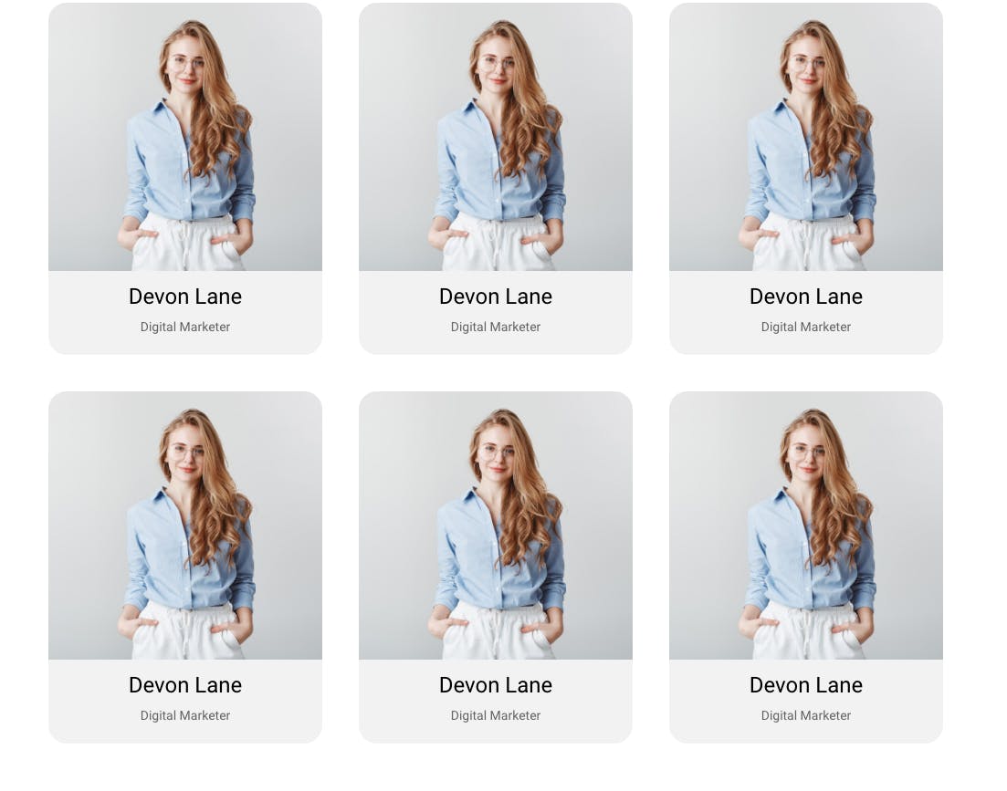
We are using the card element we created with flex layout in the last tutorial, however, you can even use simple Box elements with fixed width instead, to see the effect of these CSS properties.
This image from Freepik is used in this tutorial.
Step 1:
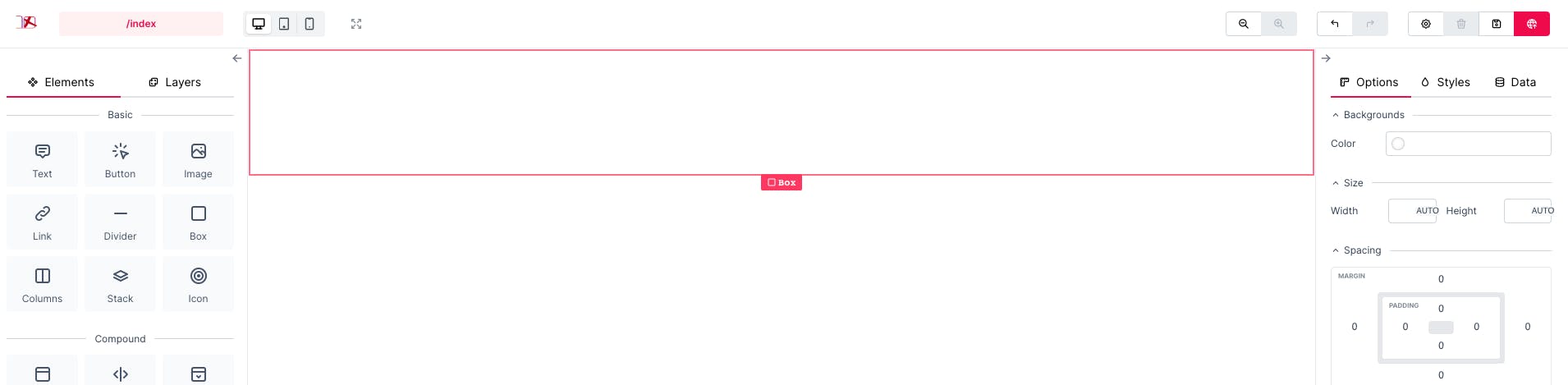
We start by adding a Box that renders a div element to our page.
Step 2:
Add 6 copies of the card element to the Box, and this is how it will look like:
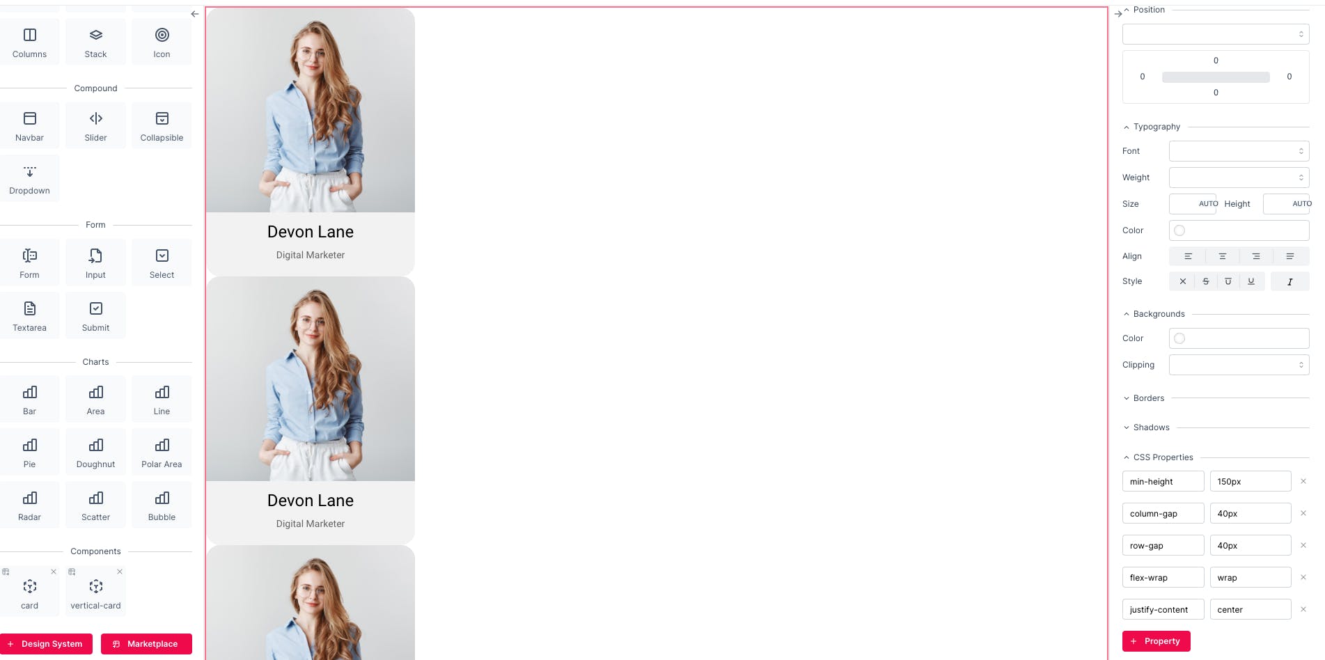
Note: The default value of display property of Box is block, that's why the components are laid in a column.
Step 3:
Set the display property of the wrapper Box to flex so we make it our flex container.
As you can see our items are placed next to each other and are shrunk to fit in the Box which is the default behaviour.
Step 4:
Set the flex-wrap property to wrap. This property sets whether flex items are forced onto one line or can wrap onto multiple lines.

As you can see in the picture above, the elements are wrapped onto multiple lines. However, there is an issue. There is no space between the elements.
Step 5:
Set the column-gap property of the wrapper Box to 40px.
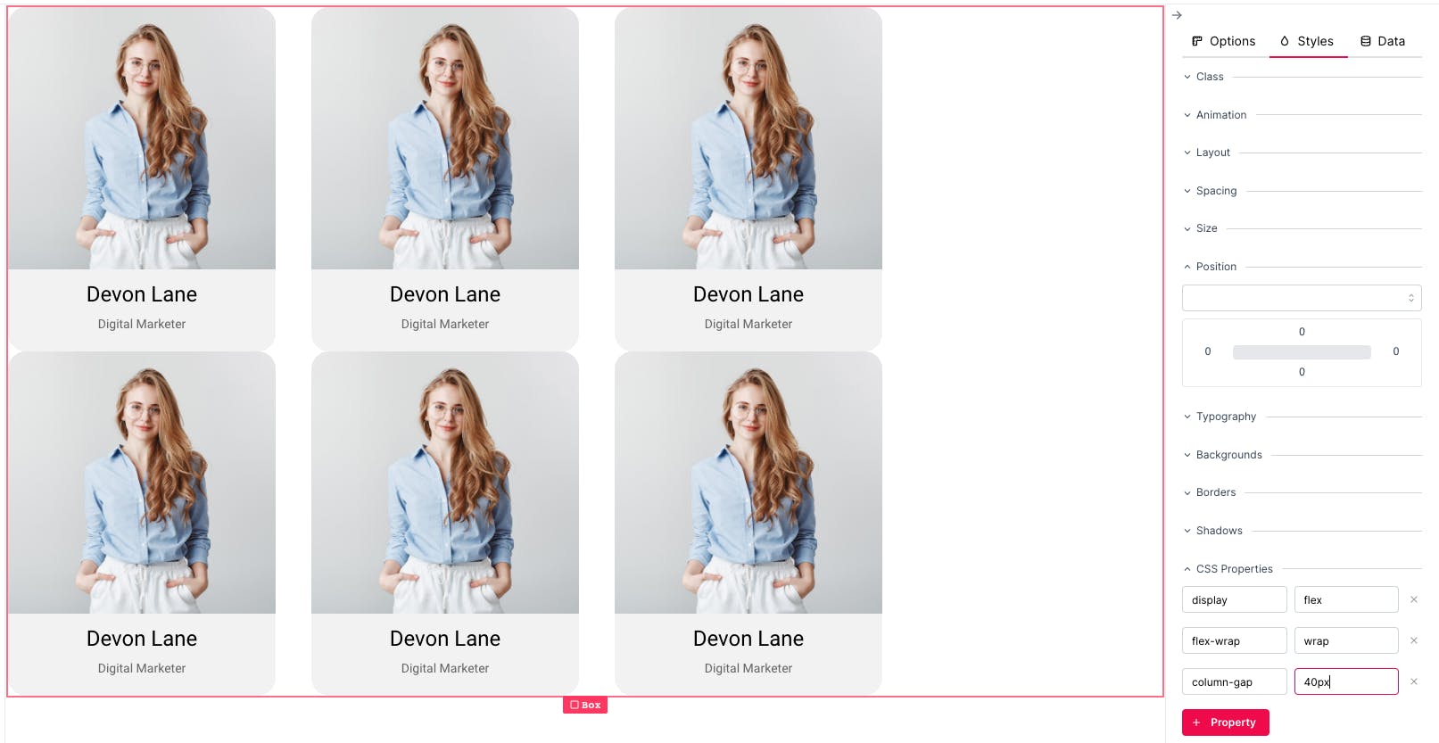
Using the column-gap property, we could create a space between columns, however, there is still another issue. There is no space between the rows.
Step 6:
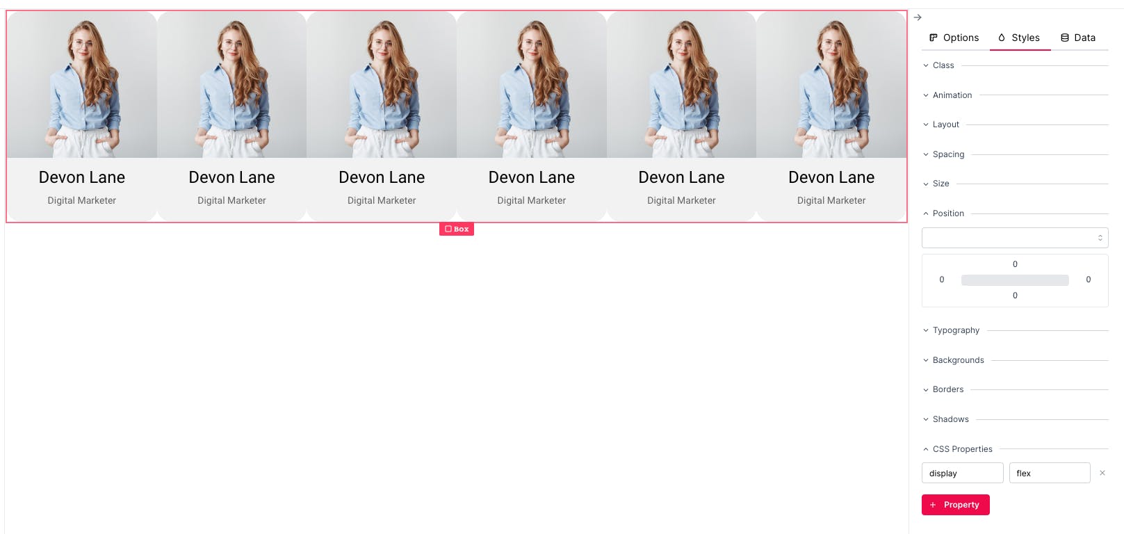
Set the row-gap property of the wrapper Box to 40px.
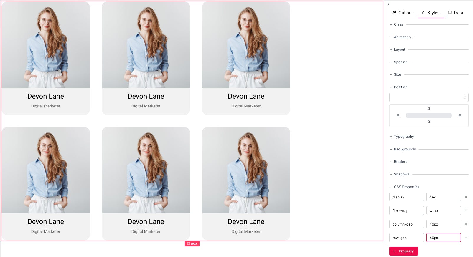
And finally, with a flashback to the previous tutorial, we set justify-conent to center to centre the cards on the screen.

Try to resize your window now and see what happens. Is this what you expected?
Leave a comment if you have any questions and follow me for practical tutorials.
Remember to create your free account at dotenx.com to easily improve your web design skills and share the results with everyone.