
Photo by UX Indonesia on Unsplash
Professional designers avoid these 5 mistakes on their websites at all costs
As a web designer, it's important to avoid making mistakes that can negatively impact the user experience or the overall effectiveness of a website.
Let's take a look at these common mistakes.
Because this is a sensitive subject I don't provide any examples for the websites making these mistakes but I show you how avoiding each of these mistakes makes a huge difference.
For each point, we'll take a look at a few examples from different categories.
Overcrowding the page
One frequent error is cramming too much information into a single page. This can not only make the website appear disorganised and overwhelming, but it can also make it challenging for consumers to discover the information they need. Instead, make an effort to spread out the text over several pages or split it up using headings and subheadings to make it simpler to read.
Examples
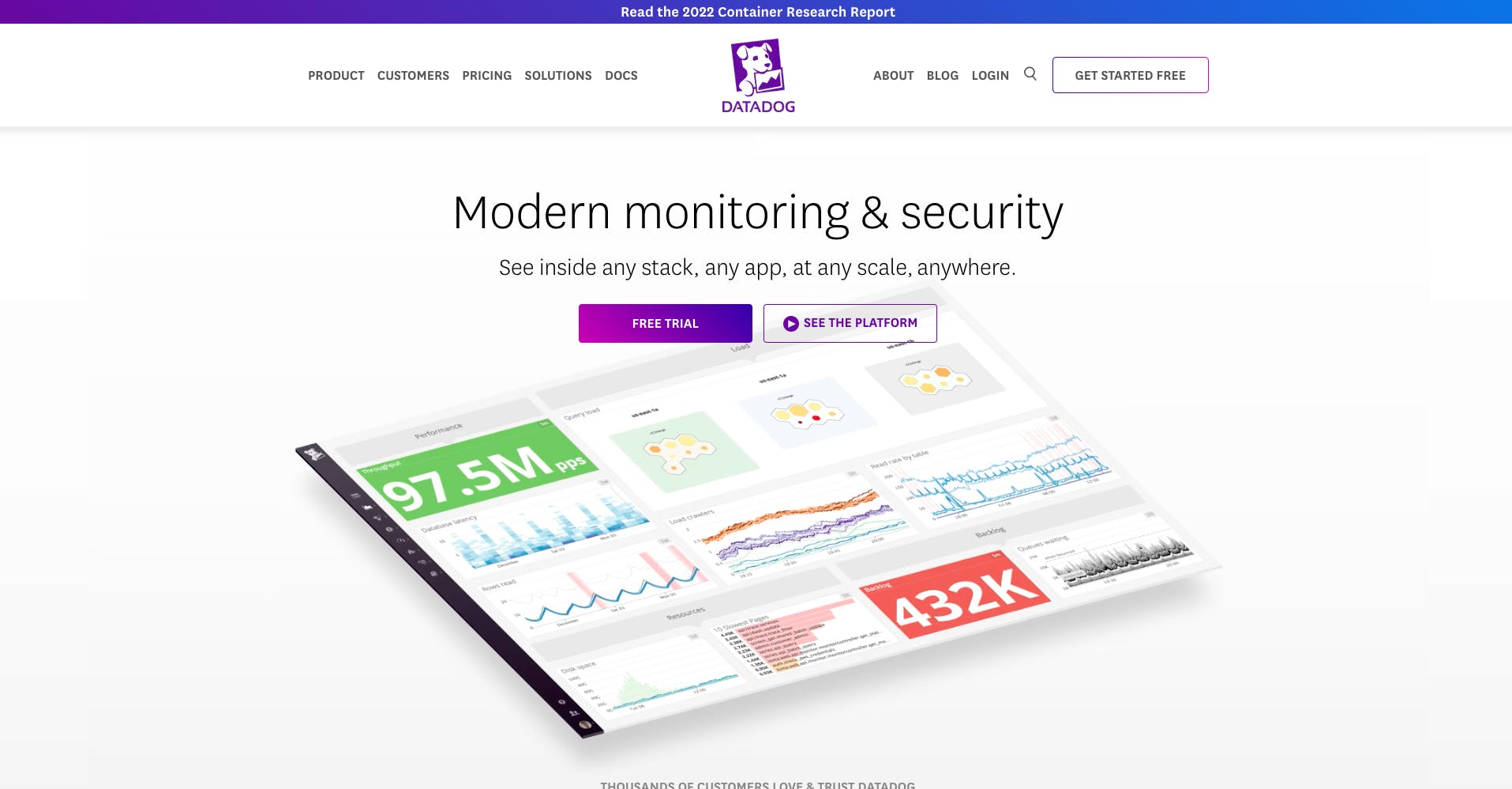
SaaS(https://www.datadoghq.com/)
DATADOG offers hundreds of services and features, but looking at their landing page you see very specific and well-separated sections without overcrowding the page.
One of the tricks that larger organisations particularly do is to have multiple landing pages helping them to avoid overcrowded pages.
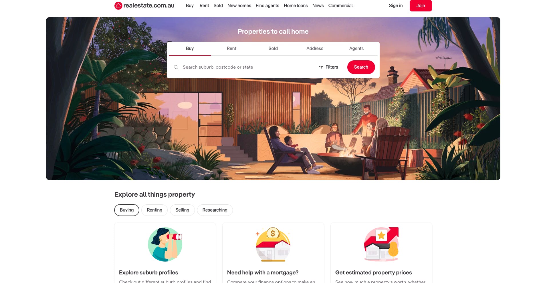
Real estate (https://www.realestate.com.au/)
This is one of the largest real-estate websites in Australia with tens of thousands of properties, yet when you look at their pages they keep each of them as clean, minimal and to the point as possible. This gives the viewers a sense of confidence in the website, and also makes it a lot easier for them to find what they actually need as quickly as possible.
Using tiny text
Using texts, including on buttons or links, which are too small to read easily is another huge mistake to avoid. Users, especially those who have visual problems or are elderly can find this annoying and may have trouble seeing small texts and not be able to navigate around the website or get the data they need. Make sure to choose a font size that can be read comfortably on all devices and screen sizes.
Examples
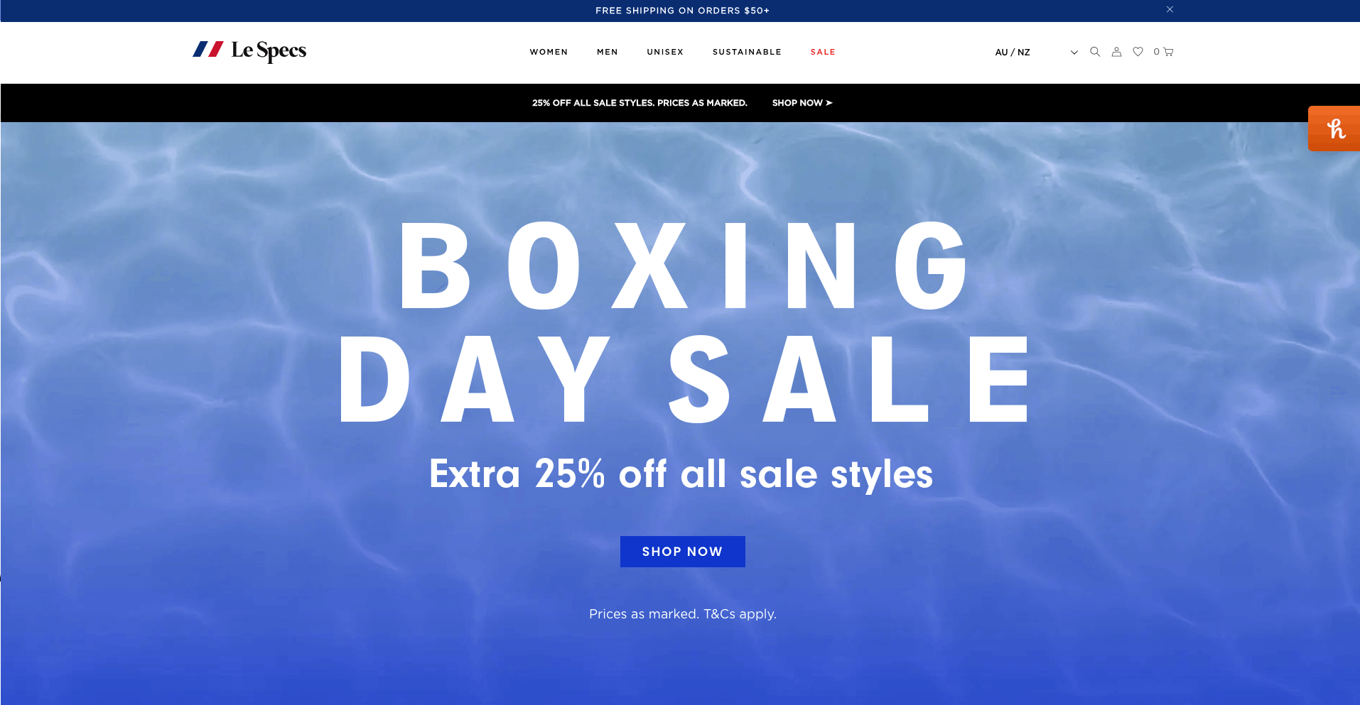
Retail (https://au.lespecs.com/)
Even without reading the name of this retailer, you can easily guess what they sell on this website. It's really important to adjust the font size based on your target audience.
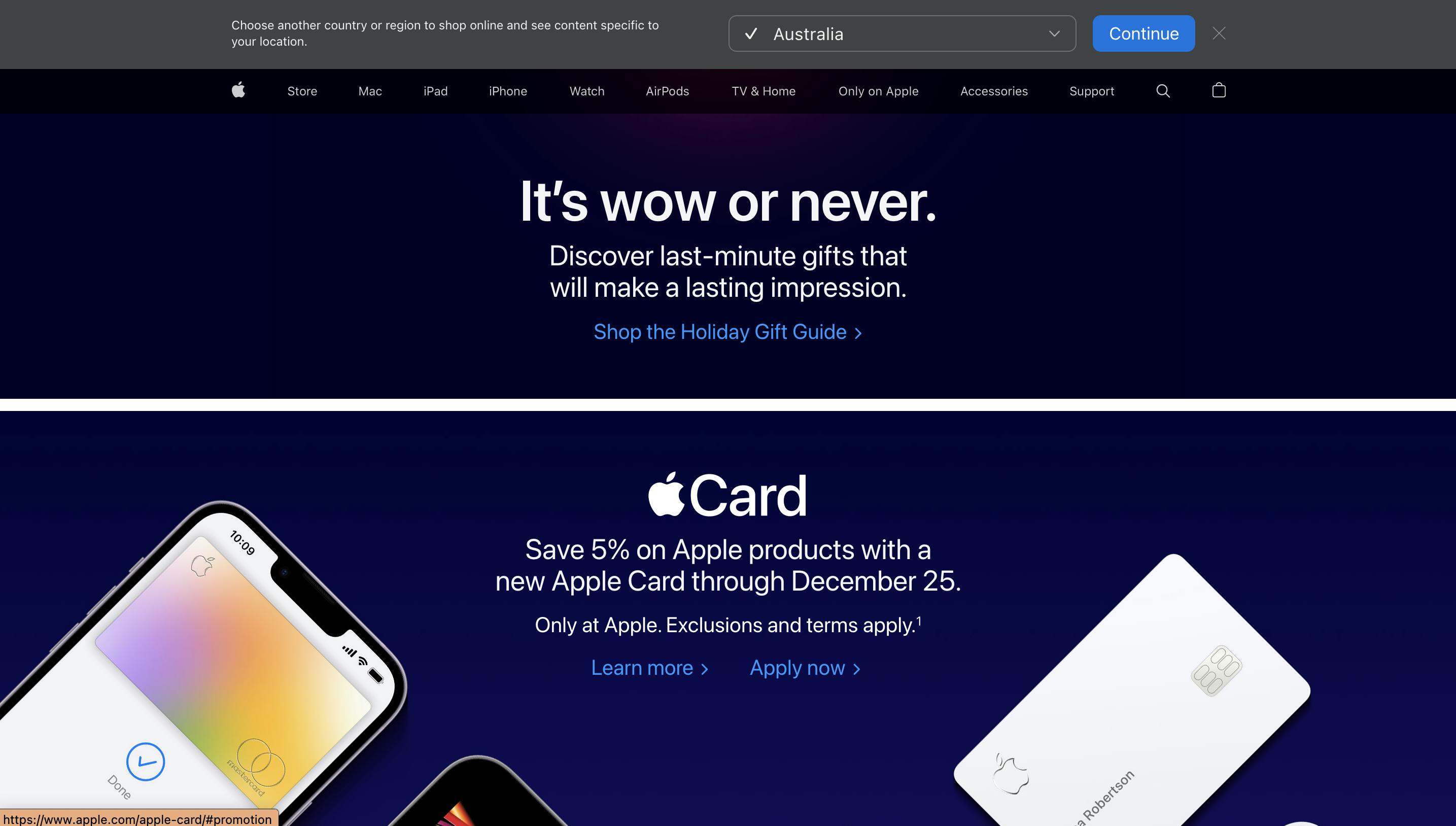
Retail (https://www.apple.com/)
Apple's website is another example of how important it is to use fonts large enough to easily read the information the company wants to convey. There is no limit on how many sections of a web page can use the larges font size as long as you avoid overcrowding the page.
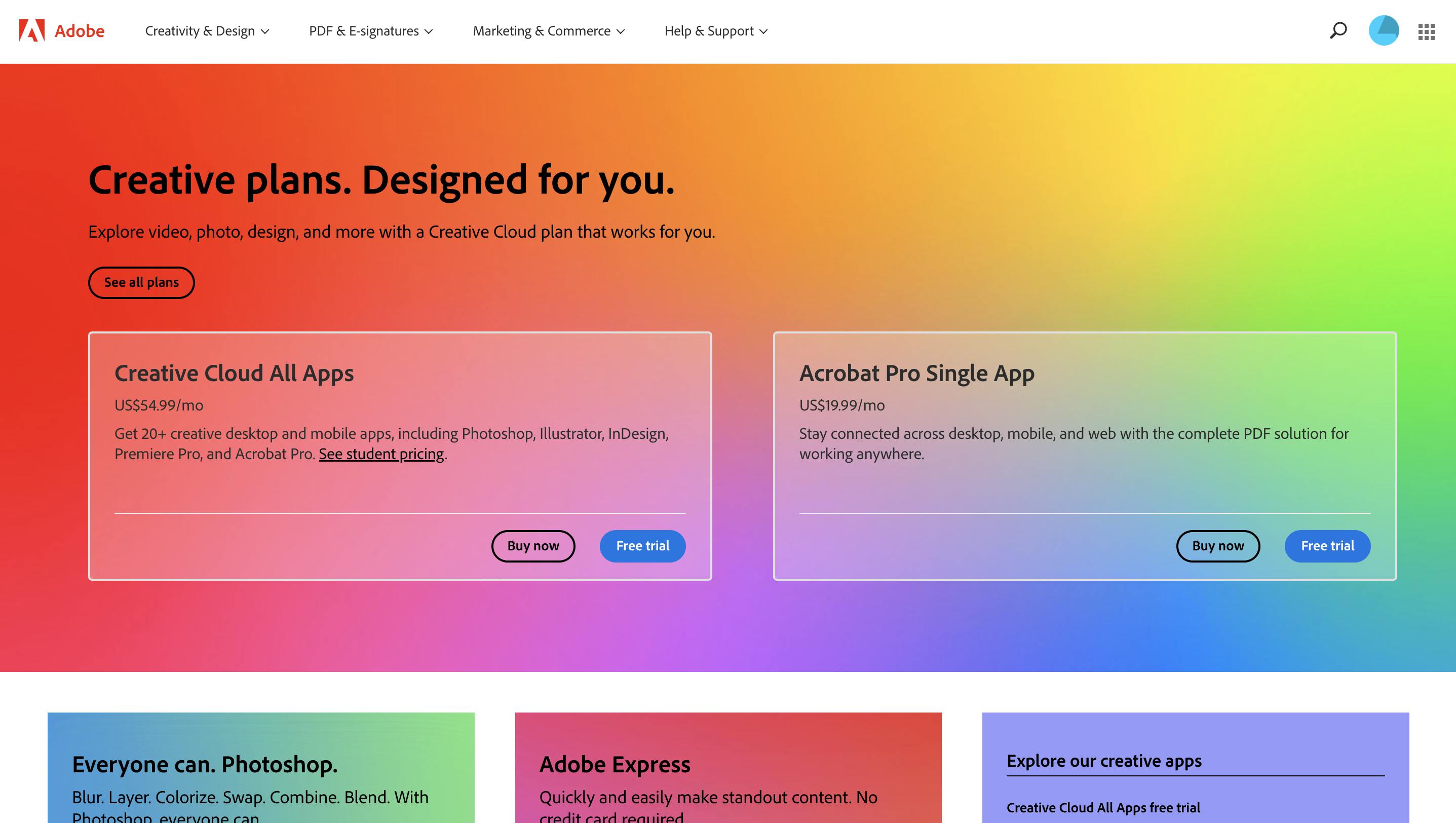
Design(https://www.adobe.com/)
On the contrary, Adobe, knowing their target audience, take a more radical approach, and not only use smaller fonts, they use background colors that you most likely will never see on a retail website.
Ignoring mobile users
It is essential to have a mobile-friendly website in the modern era. Since mobile devices account for more than half of all internet traffic, it's critical to ensure that your website functions and looks great on them.
Use of fixed-width layouts that don't adapt to the size of the screen and the use of buttons or links that are too small for users to simply tap on a small screen are some typical mistakes to avoid. This may make it challenging for users to access and engage with your website on mobile devices, which may result in a negative user experience.
Use responsive design approaches to guarantee that your website's style and content adjust to the size and orientation of mobile devices in order to build a mobile-friendly website.
Examples
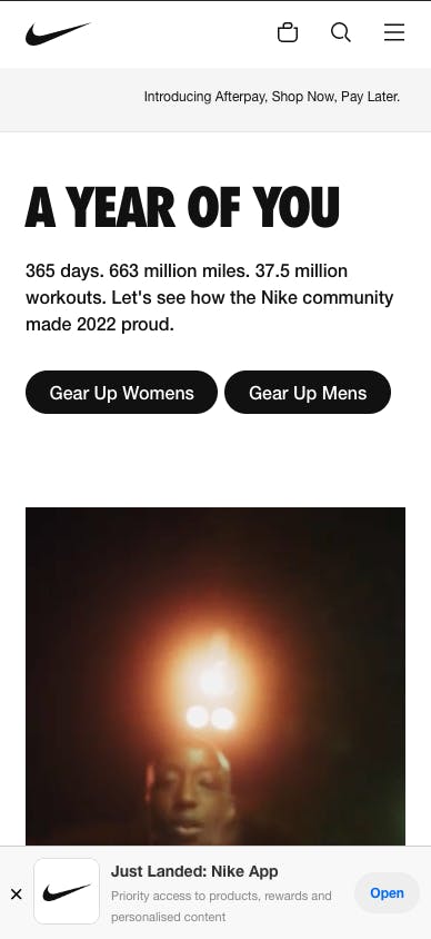
Retail (https://www.nike.com/)
Nike not only gives you a custom experience on mobile devices, but they also offer their mobile app on smaller devices.
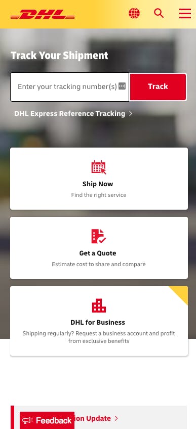
Courier (https://www.dhl.com/)
It's a common practice in well-designed websites to hide some sections on smaller device sizes, change the order of sections or reduce the details of each section.
Using too many different fonts
Although using multiple fonts on a website is fine, utilising too many might make the design appear cluttered and amateurish. For a unified appearance, limit the number of typefaces you employ and utilise them consistently across the entire page.
Examples
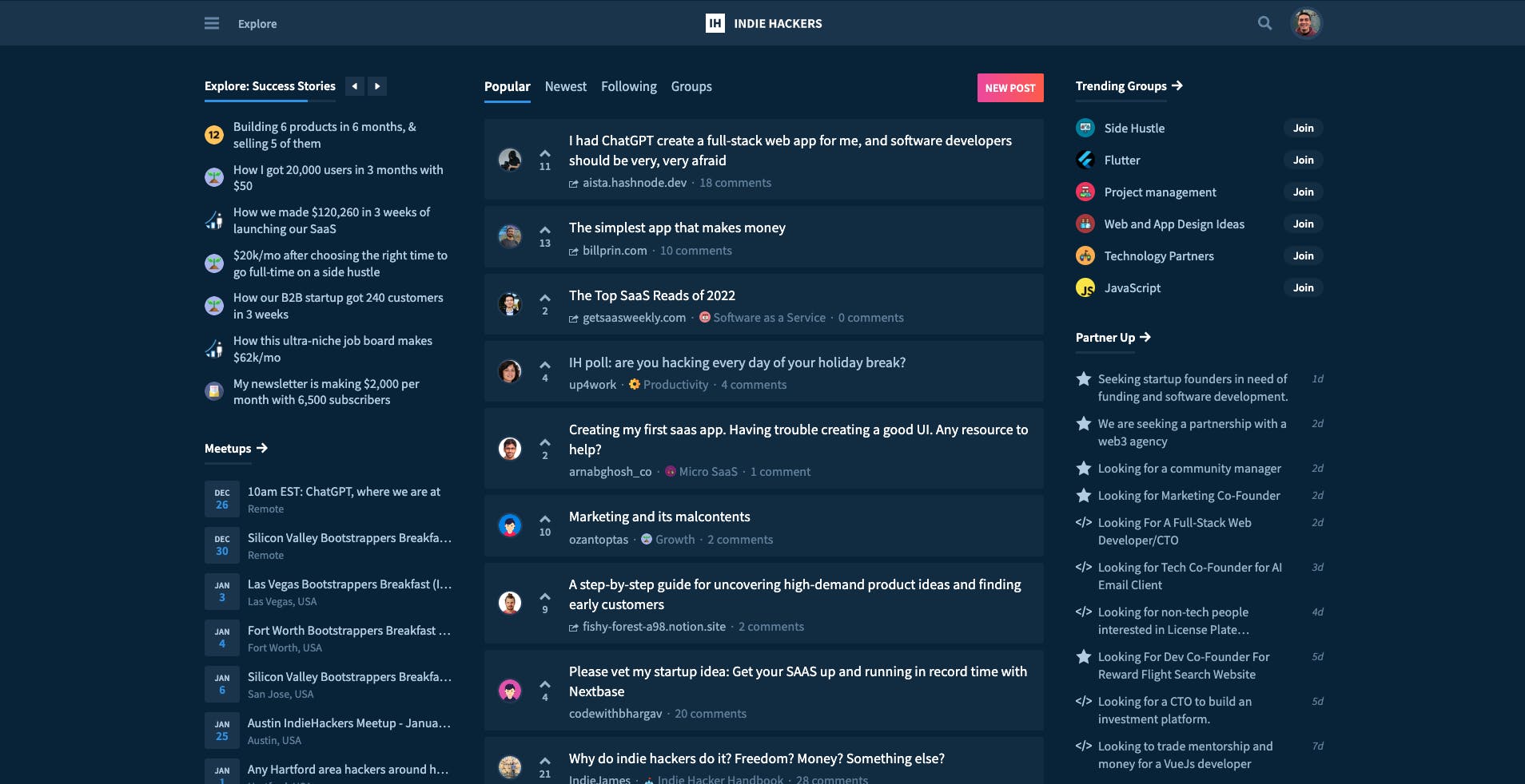
Community (https://www.indiehackers.com/)
A community such as Indie Hackers is full of textual context and barely any other visual elements other than small profile pictures or emojis can be found on each page. It's easy to think, using different fonts is the best way to add variety to the website but in reality, the opposite is true.
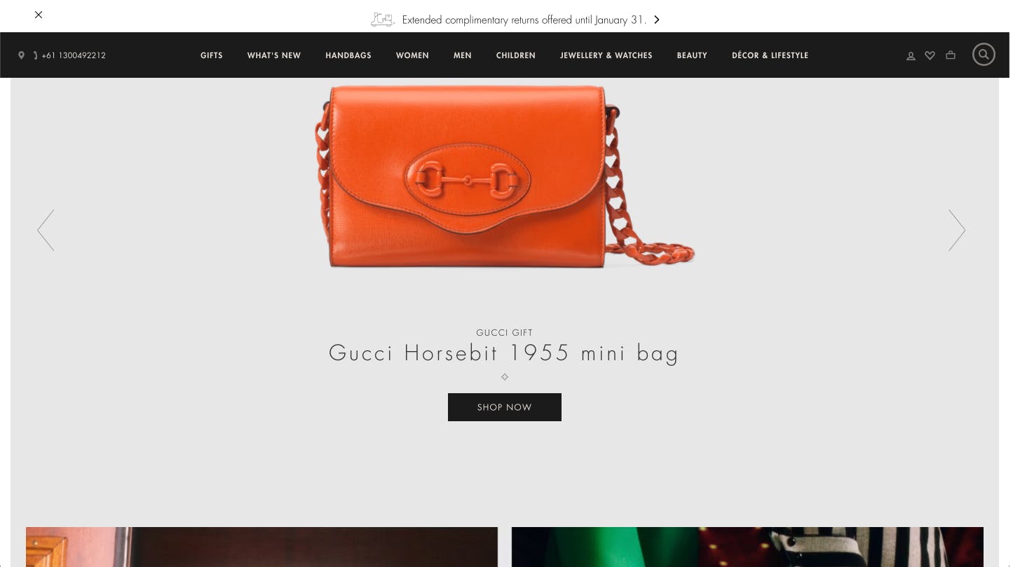
Fashion (https://www.gucci.com/)
It's important to consider the context of your website to decide how much variety is too much. The luxury fashion house Gucci, considering its target audience takes a different approach that better matches its design philosophy and uses a larger set of font types while maintaining elegance and avoiding overdoing it.
Not using clear calls to action
A call to action (CTA) is a button or link on a website that directs visitors to perform a particular activity, such as viewing a product page or subscribing to a newsletter. These components are essential for increasing website engagement and conversion. CTAs need to be clearly visible and simple to find in order to be effective.
They shouldn't be obscured, difficult to find, or designed to look like the rest of the website. In order to attract the user's attention and compel them to act, they should instead be conspicuously noticeable and stand out.
Examples
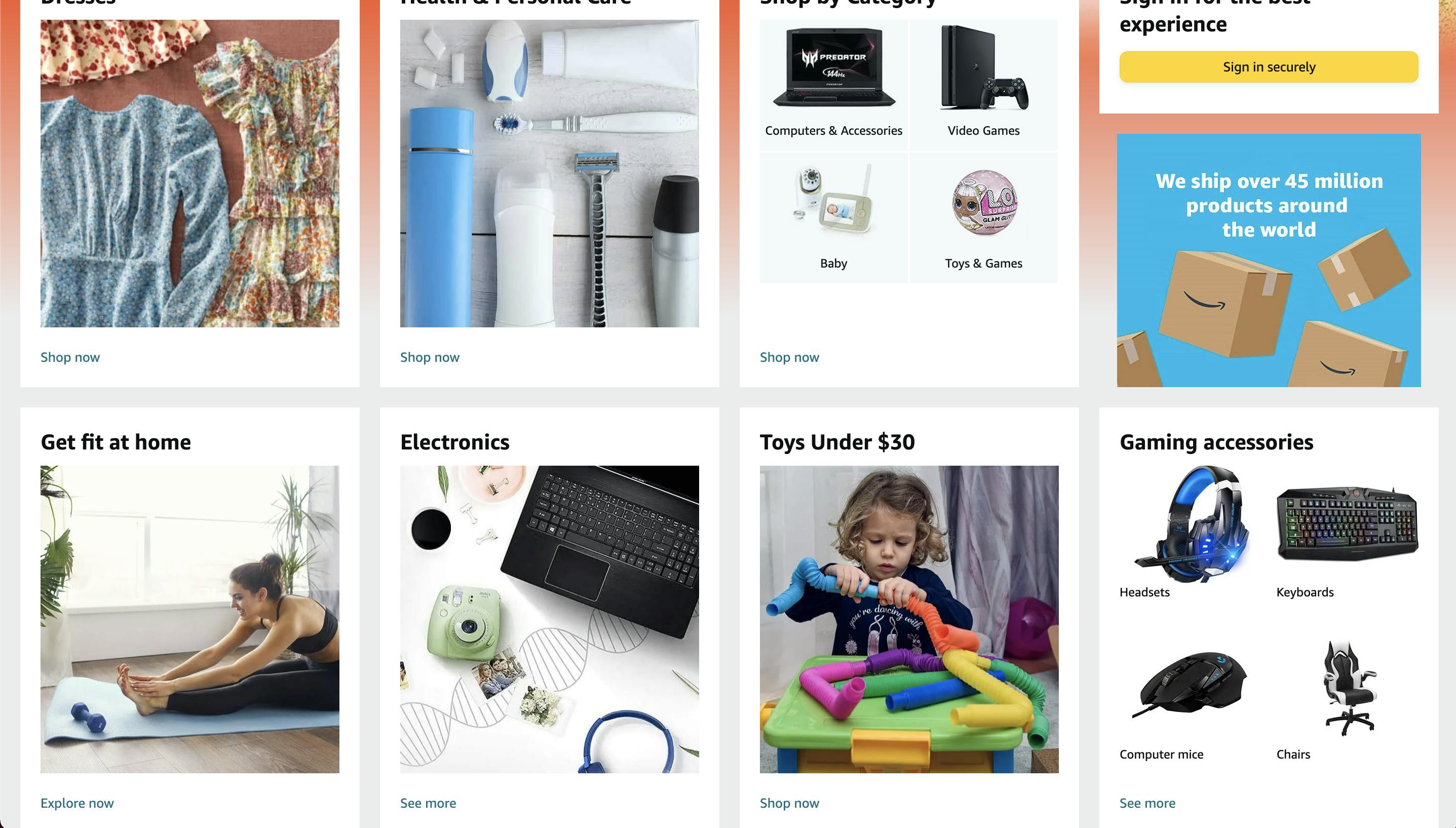
Marketplace (https://www.amazon.com/)
There is virtually no limit on how many CTAs you can have on any page. An extreme example of this is Amazon's website.
Due to the nature of the service Amazon offers on its website it should have too many CTAs each of which should stand out. To avoid overcrowding the page, they have used a minimalist design for each section and with only two font sizes (title and CTA) they have helped their numerous CTAs to stand out.
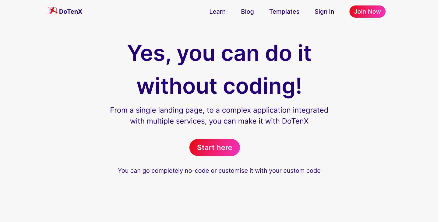
DoTenX (https://dotenx.com)
Exactly opposite to a marketplace like Amazon, DoTenX takes an approach that is typical of SaaS websites. With CTAs, DoTenX uses very different colours to direct the users towards the desired actions.
Did you know that you can implement your websites or landing pages with or without coding on DoTenX for free? Make sure to check it out and even nominate your work to be showcased. DoTenX is open-source and you can find the repository here: github.com/dotenx/dotenx.
