


One of the beauties of CSS is that you can apply significant effects to your elements without having to use image editing tools such as Photoshop.
In this short tutorial, we'll see how to create an appealing design by setting a blurred background for a text.
As always, I'm using DoTenX(dotenx.com) UI-builder to build the page and immediately get the result and publish it. You can create your free account as well if you haven't done already and create unlimited projects/pages.
Remember, when you create a project on DoTenX switch to advanced mode as we want to have full control over the page styles.
Step 1:
Add a Box element to the page which renders a div in our page.
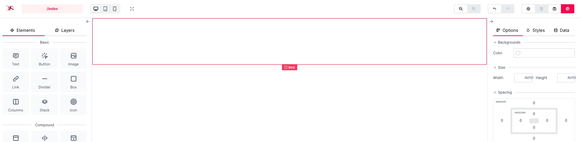
Step 2:
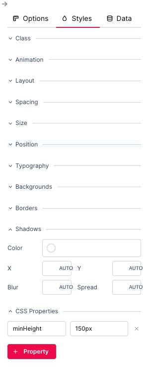
Go to the css properties in the styles tab and set the following propery-values:
height: 660px
display: flex
align-items: center
justify-content: center
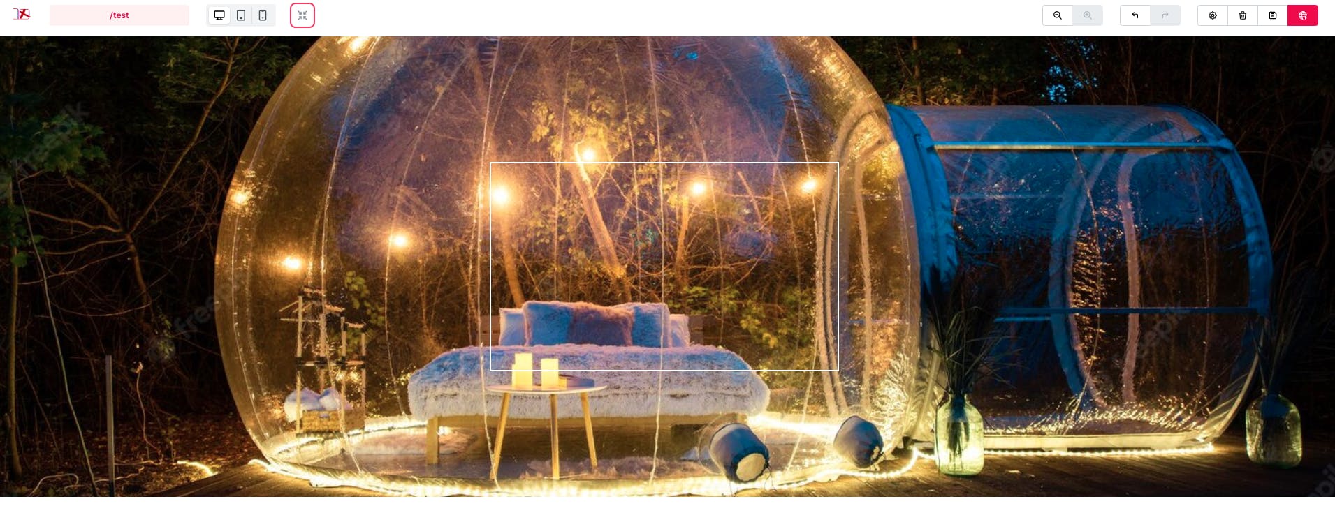
background-image: url(https://img.freepik.com/free-photo/transparent-bubble-tent-glamping-night_1268-20693.jpg?w=1480)
background-position: center
background-size: cover
\ Image from Freepik.com*
The focus of this post is not Flexbox, but if you want to learn more about Flexbox, take a look at this post: Learn CSS layouts by example - Flex.
Step 3:
Add another Box to our flex container and add these styles to the element:
width: 500px
height: 300px
display: flex
align-items: center
justify-content: center
border-width: 2px
border-style: solid
border-color: #fff
This is what we've created so far:
Step 4:
Add a Text to the smaller Box that we just created and set its css properties as follows:
font-size: 3.75rem
color: white
font-family: Arial Black
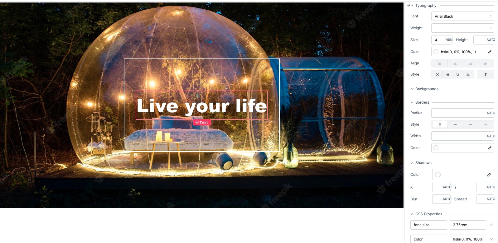
As you can see the text is not perfectly readable. All the magic happens in step 5.
Step 5:
Add the following css property to the smaller box with white border:
- backdrop-filter: blur(5px)
And this is the end result:
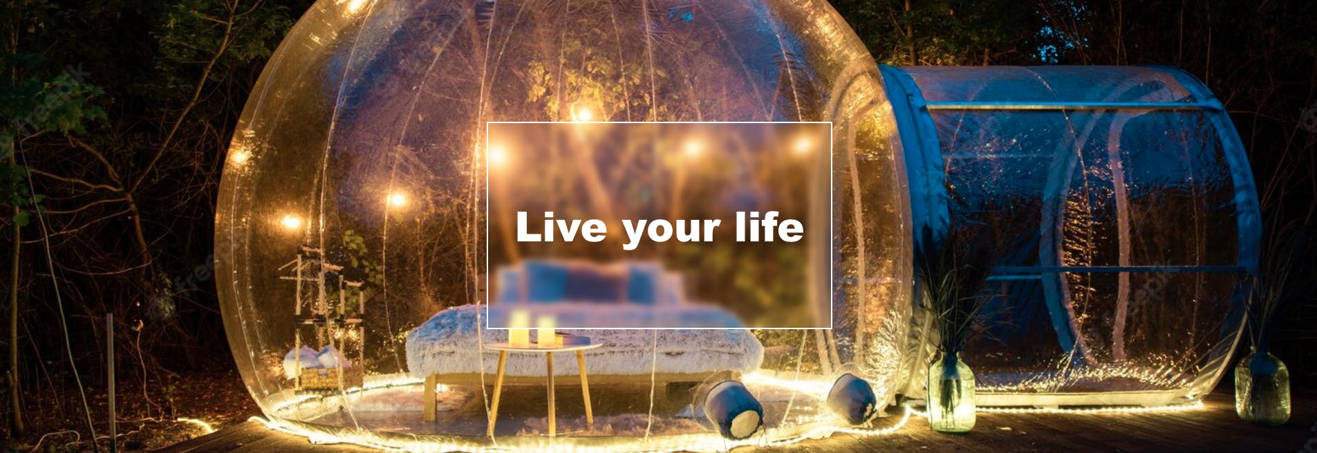
As you can see the end result looks much better with a very simple CSS property.
You can find the published result here.
Don't forget to create your FREE account at dotenx.com and you can Redeem this code (if you're quick enough before it ends) to even get more resources: h1zBW9kf.