A call-to-action (CTA) is a crucial element of any landing page. It is the button or link that prompts visitors to take a specific action, such as filling out a form, making a purchase, or signing up for a newsletter. A strong CTA can increase conversions and drive more sales for your business.
In this article, I'll discuss how to design a CTA that will grab your visitors' attention and encourage them to take your desired action.
Before we move on, remember you can build your websites, landing pages, APIs, and more, with or without coding on DoTenX for free. Make sure to check it out and use it to your advantage. DoTenX is open-source and you can find the repository here: github.com/dotenx/dotenx.
Make it prominent
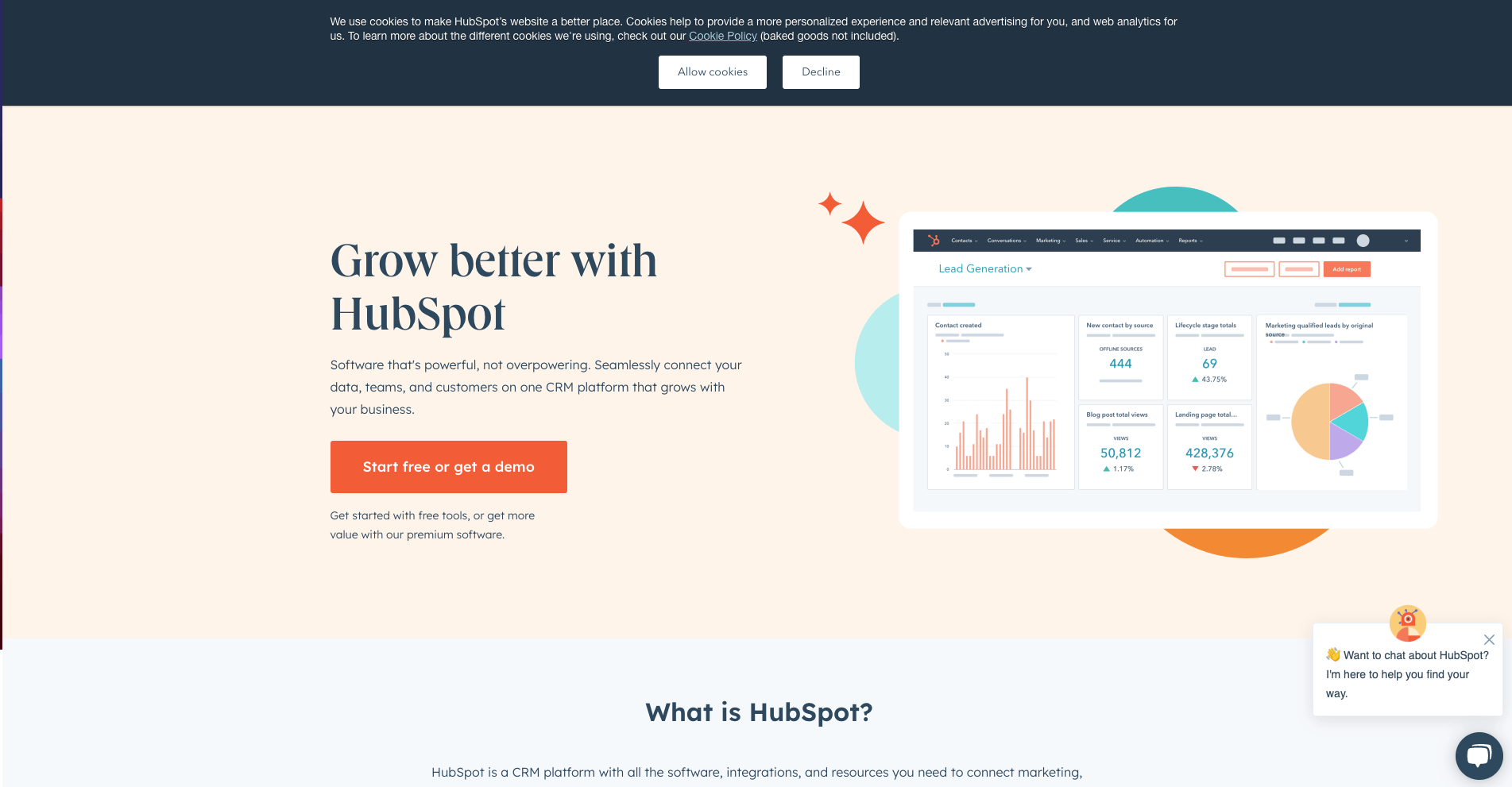
Your CTA should be one of the most prominent elements on your landing page. It should be placed above the fold, so that visitors can see it without having to scroll down. The color, size, and font of your CTA should also be visually striking, to make it stand out from the rest of the content on the page.
Take a look at the CTA on HubSpot's landing page. It's the most prominent element with the strongest color.

Use action-oriented language
The language you use on your CTA is just as important as its visual appearance. Your CTA should use action-oriented language that clearly comunicates the next step you want the visitors to take. For example, instead of using "Submit" on a form, you could use "Download your free guide" or "Sign up for a free trial."
Let's take a look at the CTAs on the landing page of Salesforce. Here you have two CTAs with clear messages allowing you to know exactly what happens next.

Keep it simple
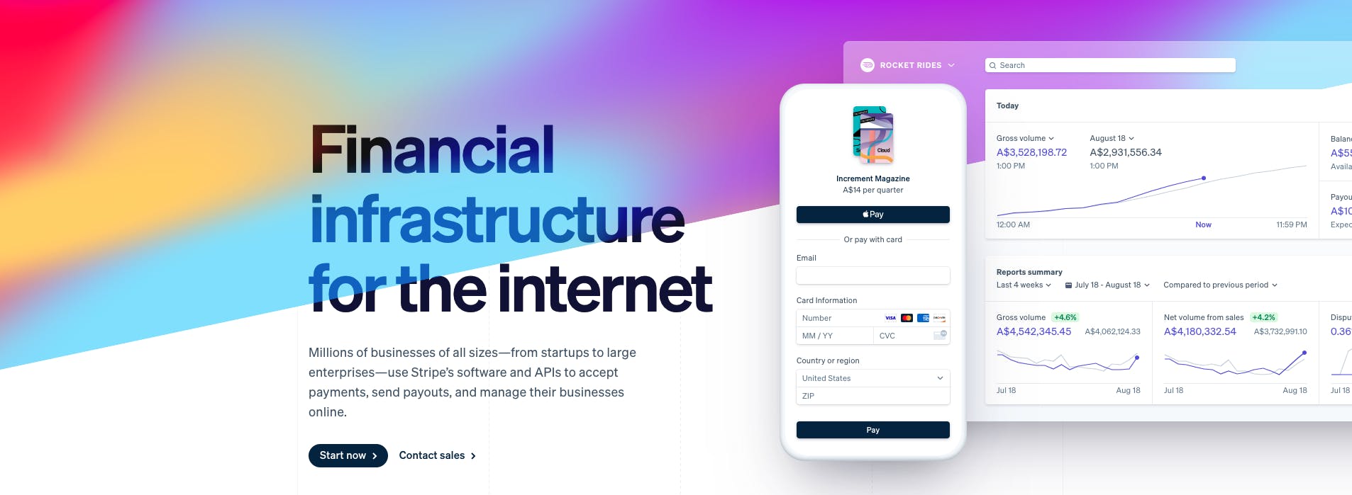
Your CTA should be clear and concise, with a single action that visitors can take. Avoid using too many CTAs on the same page, as this can create confusion and lower conversions. Also, avoid using too many words or adding unnecessary elements to your CTA, as this can make it less effective.
Stripe's landing page is a good example of having only the necessary CTAs with giving more weight to the more desirable CTA.

Create a sense of urgency
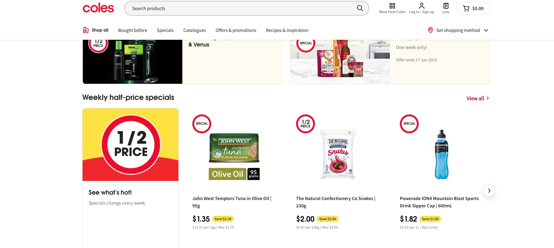
Creating a sense of urgency can help motivate visitors to take action right away. This can be done by using phrases like "limited time offer" or "only a few spots left." This can also be done through the design of your CTA, for example by highlighting the time remaining for an offer is running out or the number of spots left available.
This approach is especially common on retailers' websites. Make sure your limited time offer is prominent and easy to find to have the maximum effect.

Test and optimize
Lastly, it's important to regularly test and optimize your CTA. Try different colors, wording, and placement to see what works best for your audience. You can use A/B testing to compare the performance of different versions of your CTA. Once you've found the winning version, use that as your control and continue to test variations to see if you can improve even more.
This is what we've done with DoTenX landing page and as a result we're doing an overhaul on the landing page. By the time you read this article the landing page might have changed but regardless, it's going to be the result of tens of trials and errors!

