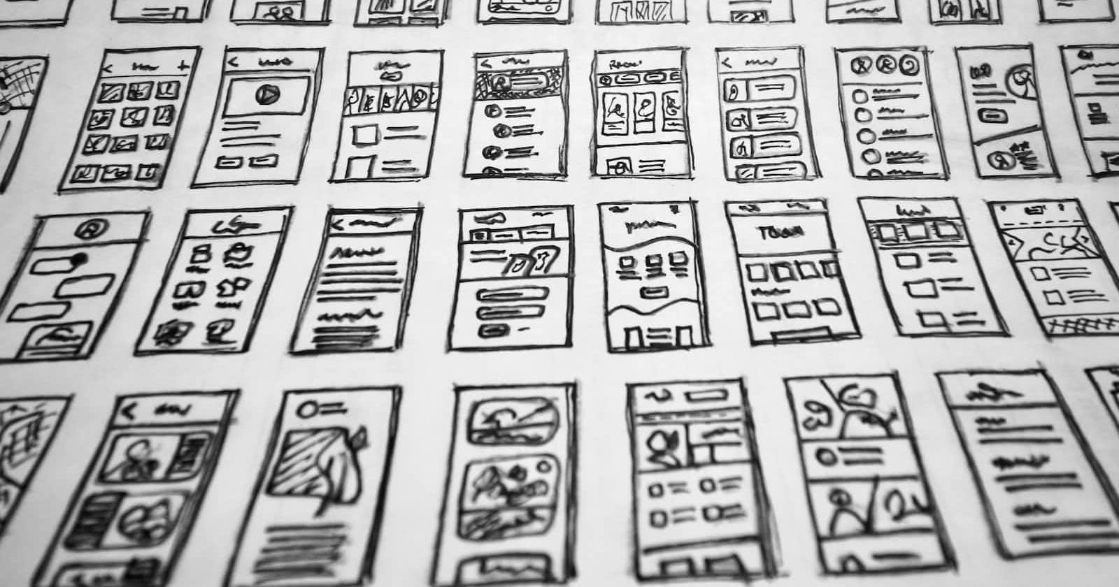
CSS layouts are a way of positioning elements on a web page. They allow you to control the position, size, and other visual aspects of elements on a page, making it possible to create complex, visually appealing designs.
The structure and look of a web page are defined by CSS layouts, which combine HTML and CSS. While CSS is used to manage the layout and style of that material, HTML is used to specify the content of a page.
There are several different CSS layout techniques, including floating layouts, flexbox, and grid layouts. Each of these techniques has its strengths and weaknesses, and the best choice will depend on the requirements of your project, however, some general guidelines can help you decide which technique to use.
Before we move on, remember you can implement your websites or landing pages with or without coding on DoTenX for free. Make sure to check it out and even nominate your work to be showcased there as well.
Here are some general guidelines for when to use each technique:
Floating layouts: Floating layouts are good for creating simple, responsive designs. They are easy to use and understand and are well-suited for creating columns and other basic layouts.
Flexbox: Flexbox is a powerful layout mode that allows for the creation of flexible, responsive designs. It's particularly well-suited for creating complex, multi-dimensional layouts, and can be used to create a wide range of designs.
Grid layouts: Grid layouts are the most flexible and powerful of the three techniques. They allow for the creation of complex, responsive designs, and can be used to create a wide range of layouts, from simple grids to complex, multi-dimensional designs.
Let's take a look at some examples of when each technique might be useful:
Example1:
One example where it might be easier to use flexbox instead of a grid layout is when you want to create a layout with a variable number of elements. For instance, imagine you want to create a layout with a series of boxes, where the number of boxes can vary depending on the content.
Using a grid layout, you would need to specify the number of columns and rows in the grid, and then use CSS to position the boxes within the grid. This can be a bit tedious and inflexible, especially if the number of boxes is not known in advance.
However, with flexbox, you can simply create a layout that can accommodate a variable number of elements. For example, you can use the flex-wrap property to automatically wrap elements onto new rows or columns, depending on the available space.
Here's an example of how you might use flexbox to create a layout with a variable number of elements:
.container {
    display: flex;
    flex-wrap: wrap;
}

.box {
    flex: 1;
}
With this code, the boxes will be positioned in a row, and will automatically wrap into new rows as needed. This makes it easy to create a flexible layout that can accommodate a variable number of elements.
Example 2:
An example where it might be easier to use a grid layout instead of flexbox is when you want to create a layout with a fixed number of columns and rows. For instance, imagine you want to create a layout with a series of boxes, where each box occupies a specific position in the grid.
With flexbox, you just need to use the order property to position the boxes within the grid. This can be a bit tedious and inflexible, especially if you want to create a complex layout with multiple rows and columns.
Using a grid layout, on the other hand, you can easily define the number of columns and rows in the grid, and then use CSS to position the boxes within the grid. This makes it easy to create a fixed layout with multiple rows and columns.
This is an example of how you can use a grid layout to create a layout with a fixed number of columns and rows:
.container {
    display: grid;
    grid-template-columns: 1fr 1fr 1fr;
    grid-template-rows: 1fr 1fr 1fr;
}

.box {
    grid-column: 1;
    grid-row: 1;
}
With this code, the boxes will be positioned in a grid with three columns and three rows. This makes it easy to create a fixed layout with multiple columns and rows.
Example 3:
A situation where it might be easier to use floating layouts instead of flexbox, is if you want to create a layout with a series of boxes, where each box is positioned relative to the previous box.
Using flexbox, you would need to use the order property to position the boxes within the layout. This can be a bit tedious and inflexible, especially if you want to create a complex layout with multiple rows and columns.
With floating layouts, on the other hand, you can easily position the boxes relative to each other, and then use CSS to position the boxes within the layout. This makes it easy to create a layout with multiple rows and columns.
Here's an example of how you might use floating layouts to create a layout with a series of boxes, where each box is positioned relative to the previous box:
.box {
    float: left;
}

.box + .box {
    margin-left: 10px;
}
With this code, the boxes will be positioned in a row, and will automatically wrap into new rows as needed. This makes it easy to create a flexible layout that can accommodate a variable number of elements.
